0:00
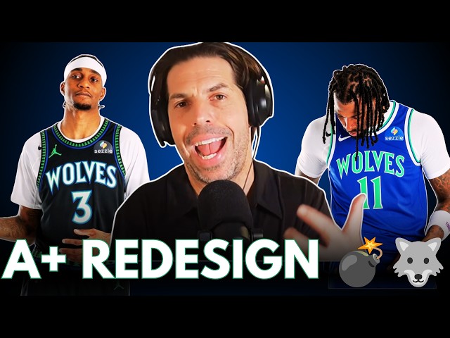
The Timberwolves just embarrassed
0:03
every modern sports designer in one
0:07
uniform league. Look at these beautiful
0:10
unis that the T-Wolves are going back
0:13
to. If they look familiar, it's because
0:16
they are. These are almost directly
0:20
linked to their original jerseys of the
0:23
late '80s when they were an expansion
0:24
team. And that alternate jersey that's
0:28
got the same typeface as the late '80s
0:30
expansion Wolves jerseys, but with the
0:33
color combination and as you see the
0:36
evergreen pattern along the waist as the
0:39
Kevin Garnett years. Oh, man, now that's
0:43
a uniform. That is a kit. I always loved
0:48
those original Wolves jerseys and you
0:51
see why. They're clean.
0:55
They're the perfect colors for the
0:57
Timberwolves. They feel Minnesota. They
1:01
feel north. They feel we are the north.
1:04
Look at that blue. Look at that green.
1:06
Look how it works with one another. Look
1:08
at just Wolves across the top in that
1:13
Look at the simplicity. Look at how
1:15
clean that is. That's just a really good
1:17
looking jersey with a great color
1:18
combination. And then you add the Kevin
1:21
Garnett era inspired black with the
1:25
howling wolf pattern or the roaring
1:27
wolf. I mean, the howling wolf were the
1:29
original. But that's a great old school
1:31
look as well that they had in the '90s
1:34
when they rebranded with KG. That's how
1:36
it's got to look. And the Timberwolves
1:39
have missed this for a while. The
1:42
T-Wolves trot have tried so many silly
1:44
things ever since those Kevin Garnett
1:46
jerseys. And even those I didn't love
1:49
and I'll show you why.
1:52
When KG had them, they had the full
1:55
Timberwolves name across. That's a lot
1:59
It squished everything together. But
2:01
look, these new rebrands, it just says
2:05
And it says Wolves, not that kind of
2:09
gothic font that they had during the KG
2:12
era, but instead that old school late
2:14
'80s font, which is great and bold and
2:16
dynamic. I love that combination. That's
2:19
it, man. That's it. That's the way it
2:23
should look, and I love it. And guess
2:25
what? That doesn't come from some Gen Z
2:29
designer sitting in a boardroom
2:32
somewhere in Beaverton, Oregon with a
2:35
bazillion Nike, you know, simulators and
2:39
AI engines trying to figure out what's
2:45
That's somebody that respects history.
2:49
That's somebody that respects the way
2:51
things used to look. And by the way, I
2:54
hate to pat myself on the back, but I've
2:56
been right about this for years.
2:59
Going back to what you used to wear in
3:02
the late '80s keeps winning. Does it
3:05
not? Look at all the teams that have
3:08
continued to go to versions of their
3:11
jerseys and their original color scheme
3:17
Somewhere between 1985 and 1995,
3:22
everybody's going back to.
3:24
By the mid-'90s, things had gotten a
3:26
little wonky. By the mid-'90s was when
3:29
you basically had a lot of jerseys,
3:31
uniforms get a redesigned for jersey
3:36
And a lot of cartoonishness,
3:38
a lot of teal, a lot of black for no
3:42
reason, a lot of disregarding your
3:44
history, your old logos, your mascots,
3:49
You have to go right back before the
3:52
mid-90s explosion of merchandising for
3:55
essentially every organization's best
4:00
This is what the Wolves are doing, and
4:01
it keeps repeating itself.
4:06
"You looked best in 1987." to every
4:10
And it's only partially tongue-in-cheek
4:13
because we keep seeing evidence that
4:17
organizations agree. Fans agree. Even
4:20
fans that were not born before that time
4:23
and remember those jerseys in real time,
4:26
everybody seems to agree simplifying and
4:29
going back to your original color scheme
4:33
is the way to do it. And I love to see
4:35
it. And I love what I see from the