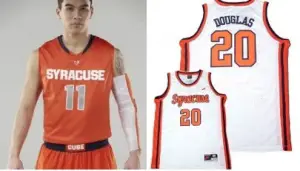
The¬†new threads broken out by SU hoops Wednesday night was an upgrade. Although, that’s not saying much.
Somewhere in the swoosh-ification of the Syracuse brand (we’re looking at you, Dr. Doom), the Orange has lost its way.
The changing of the Syracuse basketball jerseys has been a rite of passage for years now; from the¬†old-school awesomeness of the 80s, to the John Wallace¬†design of the mid-90s, to the ‘Melo title unis¬†of the early 2000s.
While the design kept modernizing, one thing kept consistent: orange, blue, white.
When our favorite college corporation sold its soul to the gargantuan sneaker company from Beaverton, Oregon, though, we lost the heart of SU.
Detached, profit-seeking, hipster designers sucked in the shoulders, tapered the waist, branded “Orange” on the front, cut off the shoulder piping and… (sigh) added sliver.
(Bleeping) silver.
We won’t even touch the FEMA-inspired football jersey disaster of the oughts.
Now,¬†The Fizz is not going to hopelessly wax nostalgic about how things were better in our day. We realize, connecting yourselves through influential shoe companies is now a reality of college athletics.¬†Hell, Ernie Davis was originally wearing¬†freaking Air-Zoom III’s on his statue.
It’s inevitable. Nike cuts a check for licensing. Syracuse (theoretically) uses said check for improvements in facilities, which in turns brings better recruits, which in turn elevates SU to #2 in the nation.
But silver? Come on.
The multi-colored thatching down the sides of the most recent hoops shorts was actually an improvement, a pretty cool nod to the bad-ass (and ultra 70s) duds of the Louie and Bouie Show days.
The new jerseys replace the silver trimmings with orange. Good.
It adds an orange belt, with a white box for “CUSE” on the shorts.¬†Better.
It morphs the shorts multi-color into hexagonal blobs. Eh. We can deal.
It continues using silver for the numerals. Dammit.
It adds a graphic of iconic campus monuments on the back. Are you f-ing kidding us?
To better understand why Syracuse jerseys have lost their way, look no further than the Nike promotional video to rationalize the new redesign.
Ryan Aanderud, Nike’s Design Director.¬†“Everyone knows the saying ‘The ‘Cuse is Loose.’ Might as well call it out and make it a little more well known on the uniform.”
Oh, brother.
“One of the key design elements to this short are the four pods. Four on each side of the short, representing the number 44, which is an iconic number to the university.”
That’s a stretch. I guess since there’s one jersey and one short, that adds up to two – which represents Syracuse’s current ranking.
Finally, the ridiculous icing to this hot-air cake.
The back of the jersey has a light screening of the GLASS-STRUCTURE in the Carnegie Library? What the hell is going on here? First, unless Arinze Onuaku sweats metallic ink and the Dome is lit by black light, how the hell would we EVER see this?
Second, I spent four years at Syracuse and may never have even SEEN the glass at Carnegie Library. The Hall of Languages? Are you kidding? Is this a basketball jersey or an “Adams Family” interpretative movie poster?
I guess Notre Dame’s new unis will have Touchdown Jesus praying over the “Harangody” stitching.
Talk about overthinking things. This is where corporate designers get paid way too much money and need to justify it every few years with inane ideas like this.
Look, let’s get real: For an entire century the jerseys were orange, blue and white, read “Syracuse” on the front, had no silver and didn’t have a campus map on the back. And those worked pretty well.
But hey, I’m sure the suits sitting in glass offices three time-zones away have a real feel for Syracuse athletics.


